 By awtech
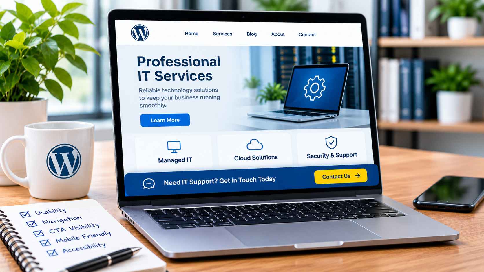
A WordPress website does not necessarily need a complete redesign to deliver a better user experience. Sometimes, the most useful improvements involve everyday interface elements: a navigation menu that is easier to understand, a contact button that remains accessible, or a form that clearly explains what information is required.
These details influence how visitors interact with a website and how efficiently they can accomplish their goals. For administrators, thoughtful technical decisions can also make a site easier to maintain without introducing unnecessary plugins or complicated design dependencies.
Improving usability begins with identifying where visitors encounter obstacles and choosing interface changes that address those specific problems.
Understanding How Visitors Interact With a Website
Website visitors use different interface elements depending on what they want to accomplish. Navigation menus help them locate information, buttons indicate available actions, and forms allow them to communicate with a business or complete a request.
Problems arise when these elements do not behave as expected. A button styled like ordinary text may go unnoticed, while an unfamiliar menu label can leave someone unsure where to find a service.
Consider a technology support website that offers several maintenance packages. Visitors should be able to compare the packages, understand their differences, and locate the appropriate inquiry option without repeatedly switching between pages.
Reviewing common visitor tasks is a useful starting point for deciding which interface improvements deserve attention.
Making Important Actions Accessible on Long Pages
Long webpages are often necessary when a business needs to explain detailed services, product specifications, or frequently asked questions. However, conventional buttons can disappear from view as visitors scroll through the content.
A persistent interface element addresses this problem by keeping a selected action accessible within the visible browser area.
Exploring Sticky CTA WordPress functionality can help website owners understand how a persistent call to action differs from a conventional button embedded within a page. Instead of requiring visitors to return to a particular section, a sticky element can remain available as they continue reading.
For example, an IT services provider might display a modest support inquiry button while visitors review its service packages. The button should provide convenient access without obscuring the information visitors came to read.
Balancing Visibility With a Clean Interface
Making an action more visible does not mean making it larger, brighter, or more intrusive than everything else on the page.
Establishing a Clear Visual Hierarchy
Visual hierarchy describes how a design communicates the relative importance of different elements. A primary action should be recognizable, while secondary actions can use less prominent styling.
On a software product page, the main action might be requesting a demonstration, while viewing documentation remains available through a standard text link.
Displaying both actions as equally prominent floating buttons could make the page harder to interpret. A selective approach keeps attention focused without removing useful alternatives.
Preventing Overlapping Interface Elements
WordPress websites may already contain sticky navigation menus, cookie notices, live chat buttons, and other floating components.
Adding another persistent element without checking these existing features can create overlapping buttons or inaccessible controls. Administrators should review how components interact at different screen sizes and make adjustments where necessary.
Prioritizing Mobile Usability and Accessibility
A desktop layout that appears well organized may behave differently on a smartphone. Narrow screens, touch interaction, and on-screen keyboards introduce additional design considerations.
Buttons should have sufficiently large interactive areas and enough spacing to reduce accidental taps. Text should remain readable, and button labels should clearly describe the associated action.
Colour contrast matters as well. A button with pale text against a similarly light background may be difficult to read, regardless of how attractive its styling appears.
Accessibility testing should also include keyboard navigation. Visitors should be able to reach interactive controls using the keyboard, recognize which element has focus, and activate buttons without a mouse.
Persistent elements should not cover focused controls, important form fields, or other essential content when the screen size changes.
Choosing a Practical WordPress Implementation
WordPress provides several ways to improve interface functionality. Depending on the website, administrators may use block editor settings, a page builder, custom CSS, or dedicated plugins.
Tools such as WP CTA Pro are among the options website owners can evaluate when considering how to manage calls to action. The choice should reflect the site’s existing technical setup and the administrator’s maintenance requirements.
Understanding the Technical Options
CSS offers two common positioning approaches. Sticky positioning keeps an element attached to a specified edge as its containing area scrolls, while fixed positioning generally keeps an element in a consistent position relative to the viewport.
Both approaches require careful consideration of available screen space, overlapping components, and responsive behaviour.
When implementing a sticky call-to-action button for WordPress, administrators should determine where it appears, which pages need it, and whether it behaves appropriately on desktop and mobile devices.
Testing changes on a staging website can help identify compatibility problems before they affect live visitors.
Evaluating Interface Changes With Meaningful Tests
A design improvement should be assessed according to the task it is intended to support. If the objective is to make appointment requests easier, button clicks alone provide an incomplete picture.
Website owners can review completed requests, form errors, abandoned interactions, and relevant engagement patterns. Comparing performance before and after an interface change may provide useful insights, although traffic sources, seasonality, and other website changes can affect the comparison.
Manual testing is equally valuable. Ask someone unfamiliar with the website to locate a service, find contact information, or submit a test inquiry. Observing where they hesitate can reveal problems that analytics reports may not explain.
A Practical Checklist for Improving Website Interactions
Before publishing interface changes, WordPress website owners can work through the following checks:
- Confirm that navigation labels are descriptive and easy to understand.
- Identify the primary action for each important page.
- Keep persistent buttons relevant to the surrounding content.
- Check that floating elements do not overlap other controls.
- Test button contrast, readable labels, and touch target sizes.
- Verify keyboard navigation and visible focus indicators.
- Test forms and action buttons across different devices.
- Review page loading performance after installing new functionality.
- Measure completed actions rather than relying exclusively on clicks.
Conclusion
Effective website usability is often the result of small, carefully considered technical decisions rather than extensive design changes. Clear navigation, accessible buttons, responsive layouts, and well-placed persistent actions can make everyday interactions easier for visitors.
For WordPress administrators, the priority should be choosing functionality that meets a genuine user need while remaining compatible with the existing website. Regular testing and performance reviews can help ensure that improvements continue to serve their intended purpose.
The best interface changes make a website easier to use without making visitors think about the technology behind it.